
It is fundamentally dishonest to alter the Y-axis on a bar graph; it should always begin at zero.
Throughout my career as a student, teacher, and researcher, I have followed this statement as a hard-and-fast rule. I have made this critique in the presentations of students and colleagues. Recently, I made this criticism in a peer review of a manuscript. I have always followed this rule in graphs that I create for publication.
The reason that I have followed this rule so strictly is that adjusting the baseline of the Y-axis is a common form of data manipulation. The graph below shows how manipulating the baseline can be used to amplify the difference between values.
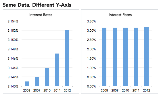
The assumption of baseline manipulation of the Y-axis is that you are clearly trying to amplify and spin a difference, when in fact the difference is negligible. Therefore, it has often been seen as an unsavory practice that makes objective scientists distrust the data.
But what if you really need to show the difference at a micro level? What if those differences are only visible when you zoom in and manipulate the baseline of the Y-axis? That’s where the rule breaks down, which was made clear to me in a presentation by Ann Emery and Stephanie Evergreen on Data Visualization Principles at the 2016 American Evaluation Association conference. Both of their websites are filled with great examples of data visualizations and the rationales behind them.
The Data Visualization Checklist
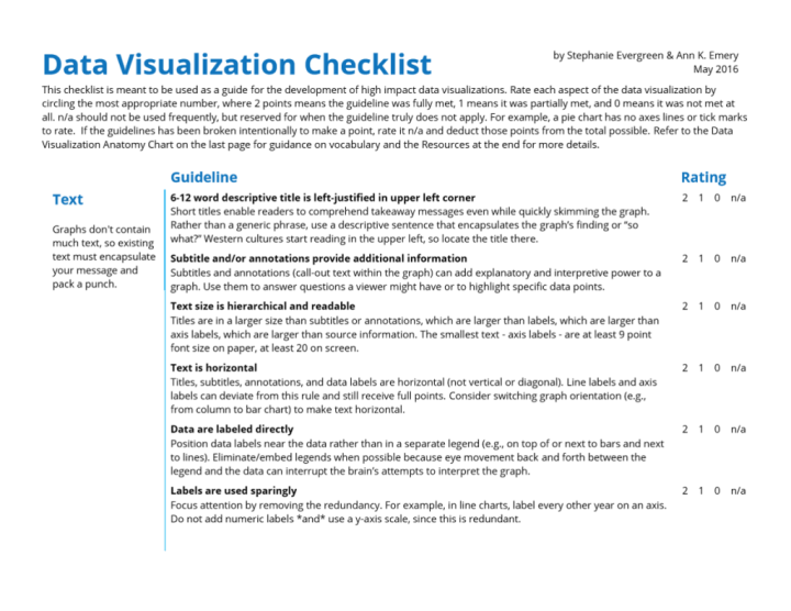
Emery and Evergreen have developed a Data Visualization Checklist (first developed in 2014 and revised in 2016) that helps you to think through the process and principles that will govern the way you present data. The checklist addresses five main constraints (or categories) that should govern how data is presented: text, arrangement, color, lines, and overall presentation. Within each category are many smaller criteria (24 in all). For instance, the following criteria fall under arrangement:
- Proportions are accurate (“…other graphs can have a minimum and maximum scale that reflects what should be an accurate interpretation of the data.”)
- Data are intentionally ordered (“…use an order that supports interpretation of the data.”)
For each criterion, a reviewer could assign a score of 0, 1, or 2, thus giving a criterion-driven, analytical approach to reviewing a data visualization. This is preferred to the default – a quick, emotional response to graphs, such as “I HATE that graph!” or “that graph is pretty!”
Aside from picking up the tool of this checklist, this presentation was more interesting to me for how it shed light on debates within the data visualization community. Evergreen commented that she had come to a disagreement on y-axis manipulation with data visualization guru Stephen Few of Perceptual Edge Consulting, a scholar she admired. Stephen Few advocated a fundamentalist interpretation of Y-axis manipulation – it should never be done. To counter, Evergreen argued that evaluators and researchers need to consider the audience for the data, and what that audience will need from the data visualization in order to make more informed decisions.
Evergreen’s example of manipulating the Y-axis on the Dow Jones Industrial Average was particularly illustrative. The question to ask before choosing the y-axis baseline is what phenomenon you are trying to display. Are you trying to show historic growth, or are you trying to show trends across a financial quarter? The y-axis baseline should be adjusted and explained in order to illustrate the point of interest.
A second illustration was Ann Emery’s encouragement for us to stop using the double y-axis. She argues that it is a confusing and sloppy short cut that misses a larger opportunity to tell an important story with data. Emery begins with the following double y-axis graph…

And ends with the following progression of three smaller line graphs…
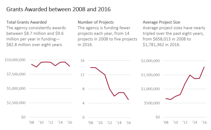
Emery’s blog post on this topic explains the rationale for this type of visualization quite clearly. Often times, we’re stuck with the default graphs that are generated through Microsoft Excel, but those should be manipulated properly. FYI, older versions of Excel will generally adjust the baseline y-axis so as to maximize the amount of change/difference in a graph. This is made incredibly evident if you graph change values in 8 different variables over two time points – inevitably, all eight graphs will have same slope. Excel 2016 for Mac appears to use zero as the default baseline.
All of this information has been helpful to learn, but it makes it evident that we must proceed carefully and deliberately when presenting data. We have to sink some time into it. We must communicate to our audience how we have adjusted the graph, and why we have chosen to do it that way. That can be done with a simple statement like, “I want to put this graph in context. I have manipulated the baseline so that we can see the changes more distinctly.” Or you might initially start by showing the graph with an adjusted y-axis baseline (where change is not evident), then zoom in on a graph with an adjusted y-axis baseline (where the change can be more evident).
Still, the decision on how to do this manipulation lies with the scientist. When engaging with the process, what ethical considerations are you taking into account? Are you even thinking about the ethics of manipulating data? Or are you just concerned with demonstrating and amplifying some type of effect?
To me, this debate encapsulated a larger argument about how I do my work as a social-scientist. Should my work follow strict rules with little room for interpretation? OR should my work be governed by broad principles that can be interpreted and contextualized? I have often functioned well in grey areas, and I have always looked to learn broad principles rather than memorize infinite rules (or bones, muscles, atomic weights, chemical structures). However, many of my colleagues do not thrive in ambiguous spaces, and their contribution is no less important. These self-perceptions were crystallized by listening to Michael Patton discuss his evolving work in complexity science and principles-focused evaluation (but more about this later).
When it comes to data visualization, I believe it is the responsibility of the social scientist (e.g., evaluator, researcher) to be principles-focused. You can manipulate data to demonstrate a particular change or effect, but how will you put that into context for your audience? How will you keep yourself from over-amplifying your results, especially if you are attempting to demonstrate the effects of an intervention you designed and implemented? Here, you are not governed by some hard-and-fast scientific rule regarding data manipulation, but rather a soft-science principle of ethical behavior. Data visualization, if done well, requires you to operate in a space where principles – even deeper ethical principles – must be interpreted and contextualized.


Hi Andy
I teach communication at a community college in San Diego. I would like to use your team policy assignment with some modifications, may I have your permission to do so?
Thank you,
Victoria